Actually, it can be ochre, yes, but it can also be gold or just a bright shade of yellow. What matters is that it shines and stands out when one contemplates a painting.
Actually, it can be ochre, yes, but it can also be gold or just a bright shade of yellow. What matters is that it shines and stands out when one contemplates a painting.

At the center of the world is the yellow dress of Martha, or rather Marie-Josephine Marthe Guyot, Max Kurzweil's wife, and muse. It is not Martha's blue, melancholy eyes, nor her long, open arms resting on the Art Nouveau sofa with floral motifs, nor her relaxed hair, nor her pale, fair skin: Kurzweil's gaze, and the gaze of anyone who contemplates this painting, can only find the yellow dress, in the shape of a moth, or a squid, or a shell, or the whole universe - the shape matters little, what seduces us is its color, that yellow. A similar phenomenon occurs when one gazes at the chaste and prude, almost constrained, portrait of the prominent Euphemia White Van Rensselaer, painted by George P.A. Healy: the tense lips and the forcibly serene face are condemned to the discretion of secondary character under that intense, boastful yellow Victorian hat. One looks and hardly sees the handkerchief that Euphemia nervously twists in her hands. You only have eyes for the hat, which both guards and shelters her as well as swallows her up. The yellow is to blame. This all started with cavemen when they started painting the walls. It was in Dordogne, between central and southwestern France (which wasn't even France at the time), that these uneducated people decided to use a certain pigment to smear their hands and use it to decorate the walls of the room. "But is this art?" the more conservative people exclaimed. "It's definitely art," said the progressives, 17,000 years later, looking at a pot-bellied horse, apparently suffering from scoliosis, very yellowish. It is likely that in the neighboring caves the voices of envy were not contained, "Even my youngest could do that...", "But art what? Where? Since when?", "It's more like a cow, it doesn't even look like a horse. Just because it's yellow...". We are talking here about the well-known Lascaux Horse, a prehistoric painting from Paleolithic times, whose title accurately describes it: it is a portrait of a horse and was found in a cave in Lascaux, France. Experts give it an age of approximately 17,300 years. What is special about this painting - or one of the features that make it special - is that it is the first, according to today's knowledge, to feature a tone from the palette of yellows. In this case, it is an ochre, a shade obtained from a pigment found in clay, from which various shades were extracted - some more yellowish, like this one, others more reddish.
The sun and its flowers
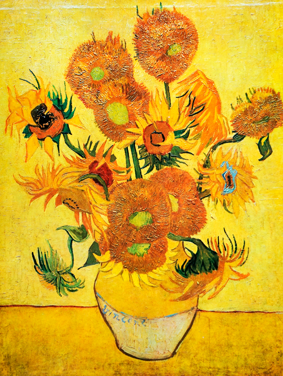
It was in the penultimate decade of the 19th century that Vincent van Gogh took the presence of yellow in painting to what will possibly be the maximum expression of that color in art. So, a little more than 430 kilometers away, and something like 17,200 years after an artist (or the youngest son of one of his neighbors, if you ask me) painted a pot-bellied horse on the walls of a Lascaux cave, the great Dutch post-impressionist raised the use of yellow to the epitome of art, and beyond any petty doubt. Obviously, Van Gogh's sunflowers will be the most visible face of the painter's extravagant and tormented use of yellow - the name of the sunflowers is not capitalized because there is more than one painting by van Gogh with these yellow plants: rather, there are several vases containing sunflowers, one with three, another with five, another with 15 (possibly the most famous of all, displayed in the National Gallery in London), another with 12, an older version of the painting with 15 (this one can be seen in the Van Gogh Museum in Amsterdam), and there will certainly be more, besides those that time, because of accidents difficult to identify, and the great wars themselves in Europe, ended up annihilating. When you look at the two different versions of the vases containing 15 sunflowers, you notice that the one on display in London is much clearer, more vibrant, and brighter than the other, the one in Amsterdam. The one in the Dutch capital was painted first. The difference between the two - and especially between the brightness and energy of the yellow in each of the layers - has a logical and easy explanation. The second was painted in the last couple of years of van Gogh's life, in Arles, in the South of France, near Marseille - about 430 kilometers from Lascaux. It was there that the artist found the light that so enchanted him and made the yellows of some of his most important works vibrate. One of these works is precisely The Yellow House (1888), a night painting by van Gogh depicting the yellow house where the painter lived. The brightness of yellow influenced many other artists. The color of the sun, sun-gods, and gold entered 19th century European art as a ray of light, which is certainly fitting. Besides van Gogh, the impressionists Monet, Manet, and Degas were some of the painters who most felt and ended up expressing the impact that a certain event would have on their paintings: the Kanagawa Convention of 1854. How, and to what extent, could the signing of a Treaty of Peace and Friendship between the United States of America and Japan alter the artistic perception of a cultural elite based in Paris? In very simple terms, this treaty allowed for the cultural rapprochement, without hindrance or fear, between two cultural poles. The exponent of the Meiji period (1868-1912), with all the associated art and craftsmanship, would end up pouring over Europe a whole new vision and a vast array of different possible approaches. The use of color was included in the package of novelties arriving from the Far East - from the land of the Rising Sun, which is of a precision that cannot be accidental, it cannot be just a coincidence. The yellow that the Japanese used in their art invaded the eyes and the expression of the European artists of that time.
The meaning of color
Ghel. This was the word used to describe that color which shone - the meaning was really "which shines" - in Proto-Indo-European, spoken between 4,500 and 2,500 B.C., that is, during the late Neolithic and early Bronze Age. Ghel is at the etiological origin of many Germanic terms, easily recognizable in English words like gold, glitter or gleam, or even yellow, although the resemblance is more phonetic and less obvious. In words with Latin roots, the presence is not so strong, since yellow is, in Latin, flavus - except when it is used as an adjective: in this case, it becomes galbinus, which is in line with the primordial matrix. It is easy to see that the yellow tone is, from the very beginning of its use (or, at least, of the use of a word to express it), related to the sun and brightness. Fortunately, there is Christianity, always ready to make any story less linear than one might think at the outset. All because of Judas and the 30 dinars - the 30 dinars were silver, but all money is the color of gold - that he received to betray Jesus Christ. Thus, Christianity turned yellow into the color of deceit and betrayal. During the Renaissance, Jews were marked with the color yellow in Christian countries - a custom that would come to be sadly and tragically appropriated by the Nazis during the Third Reich, already in the 20th century. In certain Anglo-Saxon cultures, yellow is still associated with cowardice. The Triumph of Death (1562), by Pieter Bruegel the Elder, where yellow and ochre tones predominate, is, therefore, an example of how that color was seen in European culture. Also in the paintings of Hieronymus Bosch, where hell and hellish visions are often illustrated, ochre is regularly present. Like art, meanings evolve - or meanings evolve because of art, or art evolves because of meanings, as these things are all intertwined. Once the Christian fever that marked Renaissance painting had passed, the color yellow resumed its much more cheerful and positive meaning, turned to the Sun and its divinity, to brightness and wealth. One could say that yellow recovered the happiness that characterized it - today, when we’ve accepted the role of yellow as a color that is associated with happiness and attracts attention, marketers put it in all kinds of packaging or communication signs. In painting, even before the marketeer was a profession, the genius of Picasso had already realized the power of yellow tones, which he used frequently throughout his Blue Period, using them to contrast and highlight faces and outlines. Pierre-Auguste Renoir used yellow to add luster and definition to hair in his paintings - to hair and beyond, as can be seen in The Skiff (1875), for example. In Gustav Klimt's work - who doesn't immediately remember The Kiss when yellow is mentioned in the painting? -The presence of this color - generous and luxurious, since the yellow pigment is only used in reproductions: in the original works, Klimt used gold. From Mondrian to Gauguin, passing - and landing - on Georgia O'Keefe (the mother of American Modernism painted, for example, Yellow Cactus), many were the artists who made yellow the center of their attention - just as Kurzweil did when he contemplated Martha's yellow dress, or even as that anonymous artist from Lascaux did.
Translated from the original on The Sunny Vibes Issue, from Vogue Portugal, published July 2022.Full stories and credits on the print issue.
Most popular
.png)
.png)

Relacionados


.jpg)

